4.4.3. Edit "Owner-Drawn Button ( supported by Windows )" properties.
|
To edit owner-drawn button properties, you need to click "Edit Parameters" button. Parameters fields become active, and you can now edit their values: |
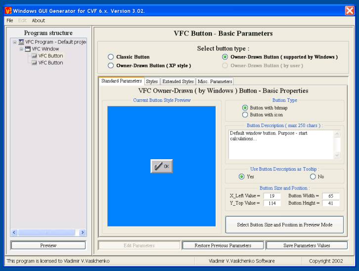
4.4.3.1. Panel "Standard Parameters".
|
Here you could change the next parameters: |
|
Don't forget, please, to click "Save Parameters Values", to save your correction. Also, if you want to continue with this project design next day(s), then you should visit "File" panel and select "Save Current Project As"... |
4.4.3.2. Panel "Styles".
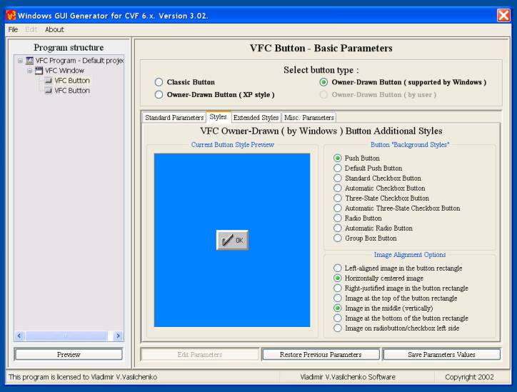
|
Here you could change the next parameters: |
|
Don't forget, please, to click "Save Parameters Values", to save your correction. Also, if you want to continue with this project design next day(s), then you should visit "File" panel and select "Save Current Project As"... |
4.4.3.3. Panel "Extended Styles".
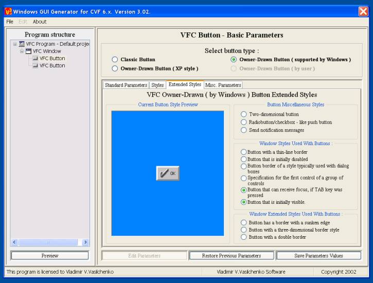
|
Here you could change the next parameters: |
| Don't forget, please, to click "Save Parameters Values", to save your correction. Also, if you want to continue with this project design next day(s), then you should visit "File" panel and select "Save Current Project As"... |
4.4.3.4. Panel "Miscellaneous Parameters".

|
Here you could change the next parameters: |
| Don't forget, please, to click "Save Parameters Values", to save your correction. Also, if you want to continue with this project design next day(s), then you should visit "File" panel and select "Save Current Project As"... |