4.4.4. Edit "Owner-Drawn Button ( XP style )" properties.

     To edit owner-drawn XP button properties, you need to click "Edit Parameters" button. Parameters fields become active, and you can now edit their values:

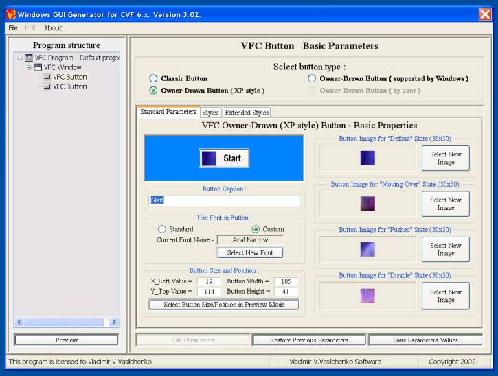
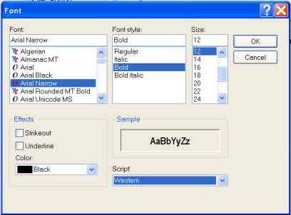
4.4.4.1. Panel "Standard Parameters".

     Here you could change the next parameters:
1. Button caption. This is the text appeared on the button. You can simply replace the current caption by new one.
2. Font for button caption. There are two possible variants - you could use standard Windows font for buttons, or select special font for this button. To do this, click on "Select New Font" and select font from the standard dialog:


3. Button size and position. Here you could set the button top-left corner coordinates, its width and height. Also, you could dispose the control in preview mode, using "Select Button Size and Position in Preview Mode" button. WARNING. If you change some button parameters, but not save them yet, then they're considered as "desired" values, not as "selected". Preview mode will work with "selected" parameters only, so you need to click "Save Parameters Value" and, again, "Edit Parameters" - now, if you call preview mode editing, then it'll work with accepted values.
4. Images for different button states.
You must remember, that all these images must have equal dimensions. Otherwise, the button view will be unpredictable. To replace selected image, you need to click "Select New Image" button for this image.


Don't forget, please, to click "Save Parameters Values", to save your correction. Also, if you want to continue with this project design next day(s), then you should visit "File" panel and select "Save Current Project As"...

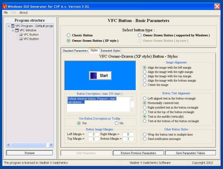
4.4.4.2. Panel "Styles".

     Here you could change the next parameters:
1. Button description. Sometimes, it could be convenient to have description for each GUI component. Also, you could save time, using control description as tooltip for it, instead of writing big help files for your program.
2. Button image margins. For this button style you can define margins, to align selected images within this frame with respect to selected image alignment options.
3. Image alignment options. There're various styles for button image alignment - you can select left- or right- aligned image and vary vertical alignment too.
4. Button text alignment.
There're various styles for button caption alignment - you can select left- or right- aligned text and vary vertical alignment too. Also, you can select "overlapped" variant for the button - button caption will be drawn on image.
5. Other button styles. Using these styles, you could insert/delete some additional visual effects for button view ( for example, multiline button ).


Don't forget, please, to click "Save Parameters Values", to save your correction. Also, if you want to continue with this project design next day(s), then you should visit "File" panel and select "Save Current Project As"...

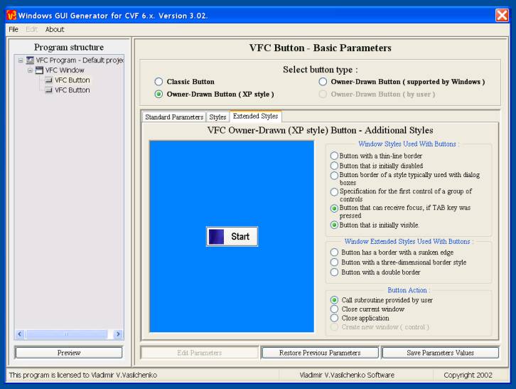
4.4.4.3. Panel "Extended Styles".


     Here you could change the next parameters:
1. Window styles used with buttons. There are some windows styles ( parameters of Win32 API CreateWindowEx  function ), which can be used with button. You can easily select/delete them here.
2. Window extended styles used with buttons. There are another set of CreateWindowEx parameters ( extended window styles ), which can be used with button, to modify button view.
3. Button action.
Here you could define the behavior of the control. Actually, you need no to perform any actions for window closing, so it's more convenient to define button with such predefined function.


Don't forget, please, to click "Save Parameters Values", to save your correction. Also, if you want to continue with this project design next day(s), then you should visit "File" panel and select "Save Current Project As"...